A Guide to Three Element Design
With all the wonderful materials that can be utilized in the construction of a door, it is important to know when enough is enough. Great design does not need to be complicated. How not to add too many elements to the design of a door is as important to the design as any other aspect. I like to stick to a self-imposed rule of three design elements.
By three elements I mean textures, materials and prominent design features. An example would be like the door pictured below. It has three primary elements: contrasting wood species, a glass element, and a bent wood “eyebrow” over the glass. Even with just three elements it is easy to overwork the design. This door pushes the boundaries on elements, but is not overly busy.
Mesquite Stiles and Rails with Sweet Gum panels, Mesquite inlays, Teak Bent Wood Eyebrow & Bronze Tinted Glass
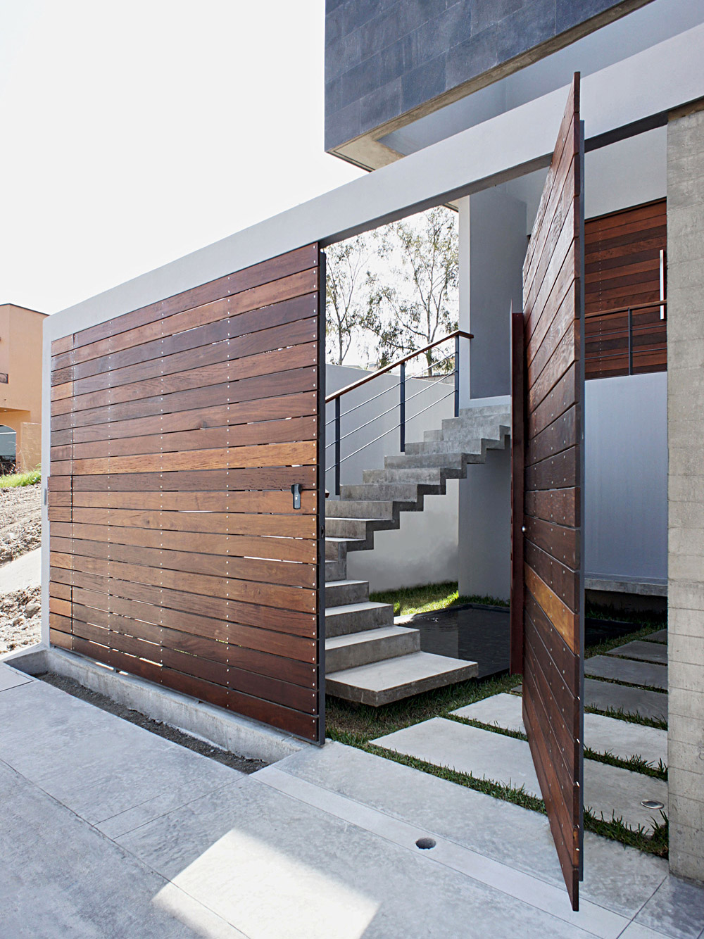
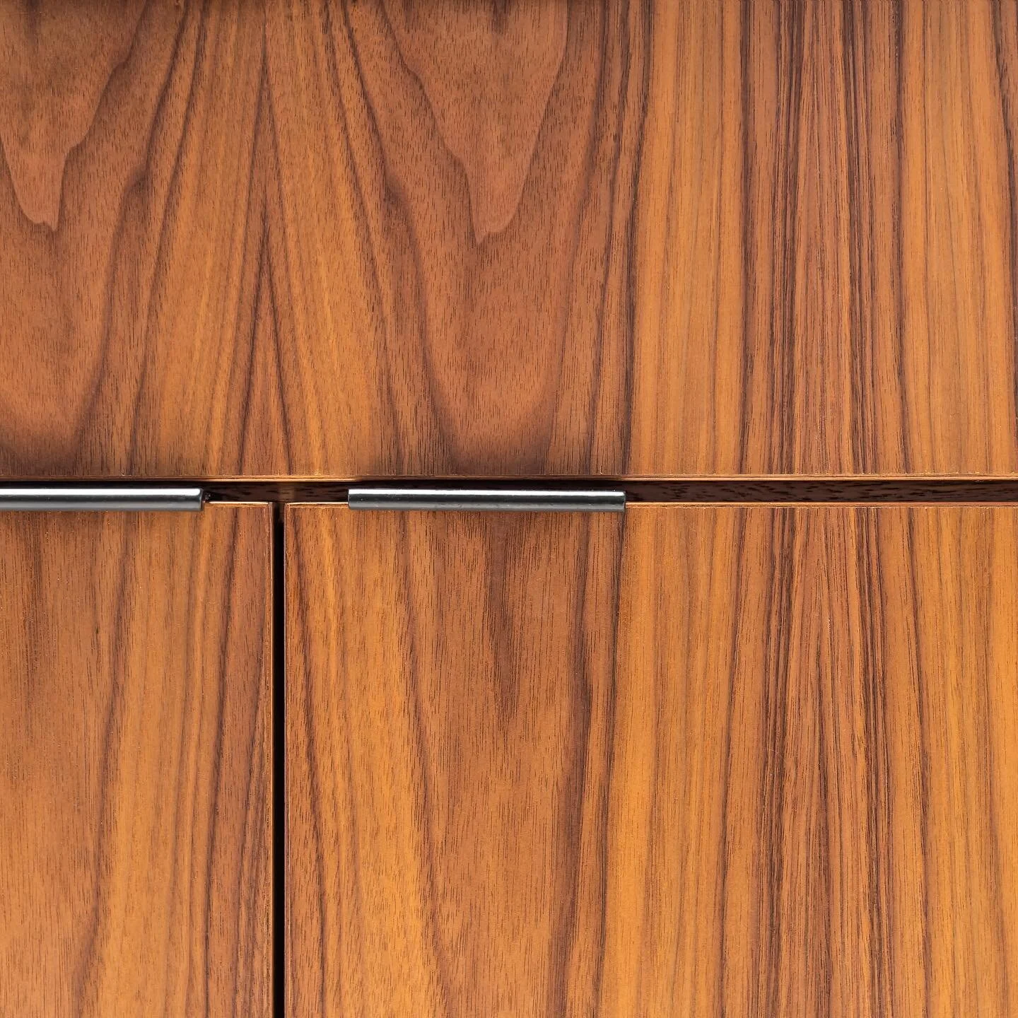
Given the trend to more contemporary/modern/minimalist doors, this three element rule isn’t really isn’t an issue. With this door style, it is best to let the materials and workmanship speak for themselves. A striking design can be achieved with minimal elements.
Modern Cherry Door with Bronze Reflective Glass & Floating Panels
Like with any other architectural features, a door should really be an expression and an extension of its surroundings. Sometimes less is more, and sometimes more is more.
Knowing when to say when is enough, is vital. The possibilities are endless. Yet design parameters can be your greatest strength.


